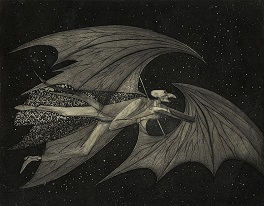
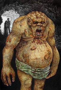
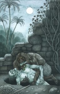
Jim Mountfield racks up another one


© Stygian Lepus


I grew up on a farm.  In fact, I grew up on two farms, one in Northern Ireland and the other in Scotland.  So when I write fiction, farms are a common setting for my stories.  That includes scary stories, which I write under the pseudonym Jim Mountfield.


A big inspiration for my ‘farm-horror’ stories was a 2005 Irish film called Isolation, written and directed by Billy O’Brien.  It’s about a lonely and financially-pressed farmer forced to take the filthy lucre of a bio-genetics company and let them experiment on his cattle.  Being a horror film, this doesn’t result in faster-growing livestock as the company hopes but some nightmarishly malformed, slimy organisms whose alien tissue is soon infecting all living things on the farm, bovine and human.  Though it’s not well-known, Infection has a great cast –  including two of my favourite Irish actors, John Lynch and Ruth Negga, plus Essie Davis and Sean Harris.


What really impressed me, though, was its bleak agricultural setting, one where soulless concrete animal-sheds and black-tarped silage pits loomed next to decaying barns and lakes of slurry, everything dark and driech in the continuously pissing rain.  This made me realise that, at least on a bad-weather day, much modern farming is so grim it’s a horror story even before any monsters show up.


© Film Four / Lions Gate Films / Irish Film Board


Last year, I had three farm-horror stories published – Wool in (the now sadly-defunct) The Sirens Call, The Turnip Thieves in Schlock! Webzine and The Shelter Belt in Witch House.  Feeling I’d rather overdone this sub-genre, I didn’t write any more for a while.  Until now – for I’ve just had a new, farm-set story published, one featuring the requisite soulless concrete sheds and decaying barns, rain and muck.  It’s called Rack and Ruin and appears in the newly-published Issue 19 of The Stygian Lepus.


The original idea for Rack and Ruin came from the roadkill I’d frequently see on the back-road beside my family’s farm in Scotland.  One very wet day, walking along that back-road, I encountered some roadkill that’d been so mashed by the wheels of passing cars, and partly-dispersed by the pounding rain, that I had no idea what animal it’d been.  I gave the gruesome thing a wide birth as I walked by it.  I would have given it an even wider berth if this had happened after I saw Isolation, for it resembled one of the squishy, hellish things in the film.


Rack and Ruin was also influenced slightly by the classic H.P. Lovecraft story, The Colour Out of Space (1927), in which a meteorite crashes in the hills of Massachusetts and releases a strange blight on the surrounding land – the property of a farmer called Nahum Gardner, who subsequently sees his crops and livestock mutate and become uneatable and unsellable and his family members die, disappear, go mad or grow horribly deformed.  This is accompanied by the appearance of an indescribable colour that exists outside the visible spectrum.


Lovecraft’s story is told through the eyes of a narrator, a surveyor, who gets the details of the story from one of the Gardners’ neighbours.  Thus, there’s little from the perspective of the farming family actually at the centre of the horror.  I thought I would try to address this in Rack and Ruin.  Farming is tough enough in the real world, being tethered to a piece of ground, toiling at it night and day in all weathers, trying to make a living from it whilst at the mercy of the natural climate and the economic one.  Imagine how much worse you’d feel if your precious land was threatened by something inexplicably cosmic in origin.


The Colour Out of Space has been filmed several times and at least one of them, a 2019 version directed and co-written by Richard Stanley, does tell the story from the viewpoint of the Gardners.  However, as Nathan Gardner – Stanley’s renamed Nahum Gardner – is played by Nicolas Cage, he hardly behaves like any farmer I’ve ever met.  The scene where Cage freaks out after discovering his beloved tomatoes have been spoiled by the pesky meteorite is funny, though.


© SpectreVision / RLJE Films


For roughly the next month, my story Rack and Ruin can be read here.  And for the contents page of The Stygian Lepus, Issue 19, and access to all its stories and articles, visit here.

Jim Mountfield keeps it in the family


© Horla Magazine


A new short story of mine, Problem Family, is now available to read online at Horla Magazine.  As it’s a horror story, it’s attributed to Jim Mountfield, the pseudonym under which I write macabre fiction.


The main inspiration for Problem Family was a real-life incident that happened to me in Colombo a couple of years ago, when I was living in a different apartment building from the one I live in today.  An extremely noisy family lived in an apartment on the floor below mine.  For some reason – the building’s acoustics, the way the stairwell was positioned – the noise they generated seemed to flow straight up to my front door.  Indeed, it sometimes seemed like the loud melodramas they were enacting were taking place right on the other side of my door.   One evening, I heard adult male and female voices screaming at each other and became convinced that, if this went on for much longer, the woman was going to be assaulted.  So, reluctantly, I ventured downstairs, ostensibly to tell them to shut up, but really to find out if I needed to report something to the police.  Thankfully, the situation proved to be non-violent – and at my appearance, the pair of them did shut up.


© SpectreVision / RLJE Films


Also, in part and completely differently, Problem Family was inspired by the famous 1927 sci-fi / horror story The Colour Out of Space by H.P. Lovecraft.  This is an account what happens after a meteorite strikes a remote area of Massachusetts.  A nearby farming family begin to succumb to what initially seems to be a weird, creeping, expanding poison but is actually a grotesque alien lifeform exuding an indescribable colour – it was ‘only by analogy that they called it a colour at all’.  The Colour Out of Space has been filmed several times, starting with a rather duff version starring Boris Karloff and directed by Daniel Haller in 1965, and most recently in 2019 with a phantasmagorical version courtesy of director Richard Stanley.  The 2019 film is slightly too reminiscent of John Carpenter’s The Thing (1982), but benefits from a striking colour palette – it’s difficult to depict unknown alien colours on celluloid, so Stanley settles for making everything a garish purple – and from Nicholas Cage in the lead role, doing the sort of acting things that only Nicholas Cage is capable of doing.


You can also hear The Colour Out of Space being read aloud on this video from the BBC’s ‘interactive culture magazine’ Collective.  Brilliantly, the reader is none other than the late, great Mark E. Smith, vocalist with and guiding light of abrasive post-punk / alternative rock band the Fall.  The sound of Smith’s thick Mancunian accent and the Massachusetts accents of Lovecraft’s characters battling for supremacy is something else.  I have to say, though, that the bit at the beginning where Smith sticks out and wiggles his tongue is as terrifying as anything in the story itself.


Fittingly for a magazine that takes its name from The Horla, the classic 1887 story by Guy De Maupassant, Horla describes itself as ‘the home of intelligent horror’.  Its main page, which gives access to a bevy of cracking stories, can be reached here.  Meanwhile, Problem Family itself can, for now, be read here.


© Librairie Ollendorff

10 scary pictures for Halloween 2021


From unsplash.com / © Nicola Gambetti


It’s Halloween today and as usual I thought I’d celebrate the occasion by displaying ten of the most interesting pieces of macabre art I’ve come across in the past year.


And what better way to start than with this illustration by the Italian-born, American-reared artist Joseph Mugnaini for Ray Bradbury’s 1972 fantasy novel The Halloween Tree?  Never having read that novel, I don’t know what the winged, cadaverous, hooked-nosed figure represents, but he makes an elegant and cosmically weird image.


© Yearling Books / From monsterbrains.blogspot.com 


In these art-themed Halloween posts I usually include something featuring skeletons, as a nod to the festival that comes immediately after Halloween – Mexico’s skeleton-obsessed Dia de Muertos, the Day of the Dead, at the start of November.  This year’s skeletal number is by Vincent Van Gogh, no less.  Known as Skeleton with a Lit Cigarette in its Mouth, it now resides in Amsterdam’s Van Gogh Museum.  The museum’s website describes it as “a juvenile joke”, painted by Van Gogh “in early 1886, while studying at the art academy in Antwerp…  Drawing skeletons was a standard exercise at the academy, but painting them was not part of the curriculum.  He must have made this painting at some other time, between or after his lessons.”  I find the painting discombobulating, not just because of the cigarette or, indeed, the revelation that Van Gogh, associated with intensity and misery in most people’s minds, actually had a sense of humour.  No, it’s more that the skeleton is such a complex assemblage, of corners, ridges, crenels, shelves and slats.  It’s almost machine-like – slightly reminiscent of the lethal, metal endoskeleton that pops up at the climax of The Terminator (1982).


From vangoghmuseum.nl/en


Going further back in time, I have to say I love this depiction of a devil, which occupies the front side of the right-hand panel in the triptych Earthly Vanity and Divine Salvation.  It was painted in the 1480s by the German-born, Bruges-based artist Hans Memling and is now on display in the Musée des Beaux-Arts in Strasbourg.  It’s the merriment with which the little fellow is dancing, on top of those sinners suffering in eternal hellfire, that gets me.  Why, he’s practically riverdancing.


From musees.strasbourg.eu


Now for a devil from a different culture and different part of the world.  This bloated, pustular apparition is what’s known as a ta-awi, a Philippine ogre / demon.  I happened across it on Cryptid Wiki, which describes the beast as “a large hideous humanoid from Philippine mythology.”  It “raids villages and devours people alive, but doesn’t eat their eyeballs because it can’t digest them for some reason.”  All I can determine about the artist is that his name is Isaiah Paul and he has a page on deviantart.com here.


© Isaiah Paul


Less in-your-face and more ambiguous – the figure depicted may not even be supernatural, but just an odd person who likes to immerse herself among water lilies – is this painting, which I believe is called Hidden Things and is by modern-day Welsh artist Kim Myatt.  In fact, I’d say it evokes the subtle strangeness of the fiction of Robert Aickman.


© Kim Myatt


In 1980, when I was both a spotty adolescent and an aspiring writer, the first stories I ever submitted were to a handsome little magazine called Fantasy Tales. (The stories weren’t accepted, but the editors were kind enough to write back and offer me advice like “When you’re typing, try leaving a space after commas and full stops,” or “It’s probably not a good idea to have six single-sentence paragraphs in a row.”)  What made Fantasy Tales so visually appealing was that it featured the artwork of Lancastrian Jim Pitts, whose exquisitely detailed and atmospheric illustrations, often in black-and-white, recalled the great artists of the 1930s and 1940s pulp-fiction magazines such as Virgil Finlay and Hannes Bok. Here’s a gothic and vampirical item that Pitts did for issue four of the magazine Dark Horizons.


© Jim Pitts


Another English illustrator I remember fondly from my youth is Les Edwards, whose work adorned the covers of paperbacks like Karl Edward Wagner’s Bloodstone (1975) and Robert Holdstock’s novelisation of the movie Legend of the Werewolf (1975).  I like Edwards’ work for being unpretentious and upfront – you certainly knew what sort of book you were getting when you saw his art on the cover – but also for its precision and colour.  This piece is called The Shade and achieves a chill despite its graveyard scene being pictured in daylight.  There’s a suggestion of mist creeping ominously in from the distant trees and the stone angel in the foreground adds to the discomfort.


© Les Edwards


A third illustrator whose work was familiar to me in my teenage years was the American science fiction and fantasy artist Rowena Morrill, who sadly died in February this year.  Morrill blazed a trail as a rare thing in 1970s paperback illustration – a woman.  Her work graced the covers of the first collections of stories by H.P. Lovecraft that I managed to lay my hands on, The Dunwich Horror (1978) and The Colour Out of Space (1978).  Her depictions of Lovecraft’s ‘Elder Gods’ as amalgamations of bits of wildly-different creatures may not be how most people imagine Cthulhu and company nowadays, i.e., with lots of tentacles, but they’re grotesquely and baroquely weird.  Here’s the picture that adorned The Dunwich Horror.


© Jove / HBJ Books


I’ve seen the Czech artist Jindra Capek described online as a ‘children’s book illustrator’.  Hmm.  I don’t know if the following picture, showing a hungry ghoul-type creature (though one civilised enough to be wearing what looks like a pair of boxer shorts) taking a bite out of a newly-dug-up corpse, is what you’d expect to see in the pages of a children’s book.  Come to think of it, though, my ten-year-old self would have been delighted by it.


© Jindra Capek


One sort of image I’ve always found unsettling is that of an insect, or general creepy-crawly, sporting the facial features of a human being.  I’m thinking of David Hedison in The Fly (1958), playing a hapless scientist whose experiments with teleportation go astray and end up grafting his head onto the bug of the title; or the scuttling, insectoid, human-faced aliens in The Zanti Misfits, the famous 1963 episode of the TV anthology show The Outer Limits.  Needless to say, I find this item disturbing.  It’s by the Belgian artist Henri Lievens, who in his lifetime created the covers for more than 200 books.  Entitled L’Araignee, its lady-faced spider is icky-looking but also, with those large doe eyes, worryingly fetching.  The lurid blue and black palette heightens its effect.


From unquietthings.com


And that’s it for another year.  Happy Halloween!